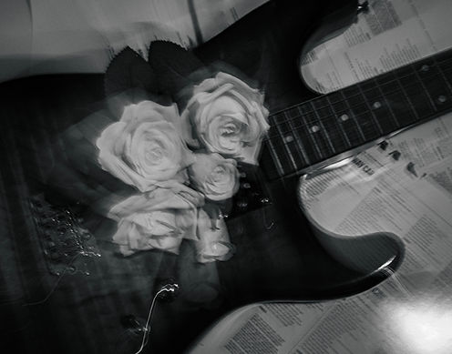
With editing these images, I wanted to focus on a black and white theme, to firstly stay cohesive to the albums aesthetic but also resemble Annie Leibovitz's work on the 2016 Pirelli Calendar. Her images in that edition showed a sense of strength, particularly feminine strength through black and white images and I wanted to do the same. With black and white, there are no distractions, no bright colours to focus on, and everything is given equal opportunity to be viewed. I wanted this for these images as there is a lot going on in them and so I experimented with both leaving a pop of colour, and also making everything black and white to see which was more impactful and if I could take inspiration from the effect that angle has on portraiture and use it to create a power behind props and objects. I do like the pop of colour in the first images and I think it allows for a main focus point in the images working with the shallow depth of field, however, I think the black and white images have a sense of added strength and power as if their contents are untouchable, much like Leibovitz's calendar.
When selecting images from my portfolio of this project to be album trailers and teasers, I intend to crop them into the correct aspect ratio for how I envision them to be consumed. Including 4:5 for an Instagram post, 9:16 for a TikTok post, 2:1 for a billboard, and 1:1 for an album cover.