
Imogen Cunningham
“Which of my photographs is my favorite? The one I’m going to take tomorrow.”
- Imogen Cunningham


Imogen Cunningham was an American photographer best known for her botanical photography, portraits, and studies of natural forms. Beginning her career in the early 1900s, Cunningham became recognised for the way she transformed ordinary subjects into detailed and striking images through careful composition and close observation. Nature became one of her main inspirations, particularly flowers and plants, as she was fascinated by their shapes, textures, and structure. Rather than simply documenting them, Cunningham photographed natural subjects in ways that made them appear almost abstract, encouraging viewers to slow down and notice details they may otherwise overlook.
Much of Cunningham’s botanical work was photographed in black and white, partly due to the photographic limitations of the time due to her using a 4X5 revolving back Graflex with an 8 inch Tessar lens for many years, but this also became one of the strengths of her work. By removing colour, the viewer is forced to focus entirely on shape, contrast, texture, and form. Her close up images of flowers such as magnolias and calla lilies almost become sculptural, making familiar natural objects feel unfamiliar and new. This links strongly to the way Cunningham encourages the audience to truly observe what they are looking at rather than quickly dismissing it as something ordinary. Her work makes viewers experience nature almost as though they are seeing it for the first time, paying attention to details and subtle forms that are often ignored due to familiarity.
Cunningham was also a member of Group f/64, a group of photographers formed in the 1930s who focused on sharp-focus photography and highly detailed imagery. The group rejected soft-focus photography styles and instead believed photography should capture subjects with clarity and precision. This can be seen throughout Cunningham’s work through the sharp textures and detailed forms within her botanical photographs. Although my own work differs visually in some ways, particularly through my use of softness, haze, and atmosphere, I relate strongly to the group’s interest in encouraging viewers to pay attention to small details.
Cunningham’s work links closely to my own project surrounding change, observation, and attention. I like her work a lot because when I first look at many of her images, my immediate thought is not that they are flowers or botanical imagery. I find it interesting how she is able to photograph these subjects in ways that make them appear almost completely unrecognisable at first glance, and only through spending more time looking at the image does the viewer begin to understand what they are actually seeing. This idea of forcing the audience to slow down and observe more carefully strongly connects to my own work and concepts throughout this project.
Although I am not using black and white imagery within this project, Cunningham’s work has made me interested in how my own photographs would appear if edited in black and white, and whether removing colour would change the viewer’s perspective and focus on the image. Because of this, I would like to experiment with editing some of my existing images into black and white to explore whether this changes the way textures, shapes, and details are perceived.
Similar to Cunningham, I have used close cropping and decontextualisation to isolate textures, patterns, and forms within nature so the viewer is encouraged to look at them more carefully and from a more holistic perspective rather than simply recognising the subject immediately. While our work differs visually, particularly through my use of colour, softness, and atmosphere, Cunningham and I share very similar concepts behind our work. I find it interesting that two projects can explore such similar ideas surrounding observation and perception while producing completely different visual outcomes.
“There was a pursuit in the art world to see something really cleanly and precisely and with clarity.”
- Meg Partridge
“The reason during the twenties that I photographed plants was that I had three children under the age of four to take care of, so I was cooped up. I had a garden available and I photographed them indoors. Later when I was free, I did other things.”
- Imogen Cunningham
"Whether it’s an architectural aloe plant, the delicate tower of jewels seen in a magnolia, the bold geometric agave leaves or the reaching fingers of an aloe shoot; they make you look at the mundane and see the beautiful."
- Natalie Watson

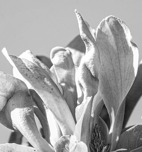
Imogen Cunningham, Callas, about 1925
This image by Imogen Cunningham is a strong example of how Cunningham transforms botanical subjects into something much more abstract and sculptural. At first glance, the image almost does not appear to be flowers at all due to the close cropping, overlapping forms, and dramatic lighting. Instead of focusing on the flowers as delicate natural objects, Cunningham photographs them in a way that emphasises shape, texture, and structure, encouraging the viewer to look more carefully at the image to understand what they are seeing. I find this particularly successful because it forces the audience to slow down and pay attention to details that may otherwise be ignored.
The black and white colour palette plays a significant role within the image. I think it strengthens the image visually because it removes distractions created by colour and instead directs the viewer’s focus towards contrast, tone, texture, and form. The smooth surfaces of the flowers become much more noticeable, while the darker stems and shadows create separation and depth throughout the composition. Without colour, the flowers almost resemble sculptural objects rather than living plants, which links to Cunningham’s ability to make ordinary natural forms appear unfamiliar and abstract.
The composition is very crowded and tightly framed, with the flowers overlapping and extending beyond the edges of the image. I think Cunningham has intentionally composed the image this way to fill the frame entirely with organic shapes and curves so there is very little empty space for the viewer’s eye to rest on. This creates a sense of immersion, almost making the viewer feel surrounded by the flowers. The close cropping additionally removes much of the environmental context, meaning the audience focuses entirely on the forms themselves rather than the location or setting. The repeated curved shapes throughout the image create rhythm and movement, leading the viewer’s eye continuously around the photograph.
The angle of the photograph is also important because Cunningham has positioned the camera slightly below and amongst the flowers rather than photographing them from a standard eye level perspective. This makes the flowers appear larger, more dominant, and almost architectural. Some of the flowers curve towards the camera while others face away from it, creating a layered and dimensional effect. I think this angle contributes to the image feeling more dramatic and immersive while also helping the flowers appear less recognisable at first glance.
The lighting within the image is one of its strongest elements. The directional light creates strong highlights across the petals while also casting shadows onto surrounding flowers. While the lighting looks like it was possibly diffused slightly as the shadows are slightly softened, they give the flowers more depth and emphasise their three dimensional forms, making the curves and textures much more noticeable. The lighting almost makes the flowers appear polished or sculptural, reinforcing the abstract quality of the image. The softer tonal transitions within some petals contrast with the much darker shadows beneath them, creating a strong range of tones that gives the image visual depth and atmosphere.
The image uses a deep depth of field, meaning nearly every flower remains sharp and detailed throughout the composition. This allows the viewer to study each individual texture and form rather than only focusing on a single subject. I think this works effectively because it supports Cunningham’s intention of encouraging close observation and attention to detail. The high level of sharpness also links to the influence of Group f/64, who focused on precision, clarity, and detailed imagery.
Overall, I think this image is very successful because Cunningham is able to transform a familiar natural subject into something visually striking and almost unrecognisable. The combination of close cropping, dramatic lighting, black and white tones, and detailed focus creates an image that feels abstract, immersive, and sculptural rather than simply documentary. I particularly like how the image forces the viewer to spend time observing it more carefully, which strongly links to ideas surrounding attention and perception that are also relevant within my own project.


Following my research into Imogen Cunningham, I wanted to experiment with editing some of my own images in black and white to explore whether removing colour would change the way the viewer focuses on texture, shape, and form within the photographs. I selected three images that I felt would work most successfully in black and white due to their strong lighting, visible textures, and close compositions.
Using Lightroom, I focused on adjusting levels and contrast to create stronger tonal range within the images while also increasing sharpness and clarity to emphasise the textures and details within the flowers.
For the first two images, I felt the original compositions were already successful and filled the frame effectively, so I did not need to crop them further. However, for the third image, I decided to crop tightly into the flower to decontextualise it more from its surroundings. I think this was more successful than the original image because it removes distractions from the background and allows the viewer to focus entirely on the shapes, textures, and lighting across the petals. Similar to Cunningham’s work, the close cropping causes the flower to appear less immediately recognisable and instead more abstract and sculptural.
I do like the effect that black and white gives my images because I think it encourages the viewer to focus more on the smaller details and textures within the flowers rather than becoming distracted by colour. The contrast between highlights and shadows also becomes much more noticeable, helping to emphasise the forms and depth within the petals. Additionally, the black and white edits create a more timeless and observational feeling, which links strongly to Cunningham’s work and the themes surrounding attention and perception within my project.
Despite this being the opposite of my usual visual style, I think it would be interesting to incorporate some black and white imagery into my exhibition as it supports my project better conceptually. Throughout my project I have focused heavily on vibrant colour palettes, atmosphere, and emotional tone and while black and white removes that, I think a combination of them both could be something more progressive to present at the exhibition. Additionally, having both, possibly side by side, allows you to compare the different effect of each image, the black and white allows you to focus on detail, form, and texture without immediately recognising the subject which I think would work well for my project.
However, I would still like to gain feedback from friends and other viewers on which versions they feel are more successful and why, as I recognise that I may naturally be biased towards colour due to my existing visual style and preferences.


This feedback was very helpful because I made a point not to ask about any specific differences and if the black and white makes the subject harder to recognise, therefore both responses mentioning (positively or negatively) that the black and white decontextualises the image is very interesting. I think before choosing my final images, I'm going to experiment specifically with deep focus, black and white imagery to further this concept.