

Planning Process
For our midpoint exhibition, Ebby and I created a joint online exhibition using the software Virtual Art Gallery to showcase our work ahead of the final end of year exhibition and gain audience feedback. We chose to create the exhibition digitally as we wanted to experiment with a more interactive and contemporary way of displaying photography, allowing visitors to virtually walk through a gallery. We used the software because it allowed us to fully customise the gallery environment and create a realistic exhibition experience entirely online, which felt both innovative and engaging.
One of the first decisions we had to make was choosing the gallery environment and layout. After exploring the available themes, we selected a brutalist style gallery with large windows and surrounding nature views. We felt this worked effectively for both of our projects despite their different subject matter. My project focuses heavily on nature, observation, and environmental change, while Ebby’s project explores graffiti and urban surfaces. The contrast between the raw concrete architecture and the surrounding natural scenery linked well to both ideas, almost acting as a meeting point between our projects.
We also decided to use a two room layout. We wanted each of us to have our own dedicated exhibition space so the projects could still feel individual and cohesive, however using more than two rooms felt overly complicated and difficult for visitors to navigate easily. Keeping the layout simple made the exhibition feel more professional and accessible.
After deciding on the layout, we began selecting the images we wanted to display. Looking back through my project, I decided to focus primarily on my joiner pieces as I felt they were some of the most successful outcomes within my project so far. I think they communicate my ideas surrounding time and change particularly effectively because they allow multiple moments to exist within a single image rather than presenting time as separate before and after photographs.
However, I also wanted to compare this approach to a more traditional presentation method, so I included two photographs of the same plant taken six weeks apart displayed side by side. This allowed me to explore whether showing change directly through comparison would be as impactful as presenting it through fragmented joiner imagery.
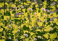
For the remaining images, I wanted to focus heavily on detail and observation. Since visitors would have the opportunity to spend time walking around and examining the exhibition, I felt it was important to include images that encouraged viewers to slow down and notice elements of nature they may normally overlook. Because of this, I selected several close up macro photographs of flowers and blossom.
These images linked strongly to my project’s ongoing theme of paying closer attention to small changes and details within the natural world. The macro compositions also contrasted well with the larger joiner pieces, creating variation throughout the room while still maintaining a consistent theme.
During the planning process, I mainly took responsibility for uploading the images into the exhibition software and organising the layout. Initially this was challenging because it took a lot of experimentation to understand the correct proportions, sizing, and coordinates needed for each image to sit properly on the walls without appearing distorted or misplaced.
After testing different scales together, we decided that an average image size of around 3 x 4 metres worked best, with a 1 meter offset on the y axis, as this allowed the images to feel large and immersive while still leaving enough wall space to comfortably display around ten works in total. This process made me think much more carefully about exhibition curation and how the physical placement and scale of work can affect the audience’s experience.
While I focused on constructing the gallery layout, Ebby worked on creating the audience feedback form using Google Forms. They designed the questionnaire so that the same questions were asked about both of our projects to keep the feedback balanced and consistent. The questions explored which images viewers found most impactful, how successfully the themes were communicated.
Additionally including some combined questions at the end regarding the exhibition as a whole and both of our work such as - how effective the exhibition worked overall as a shared experience. Collecting audience feedback was important because it gave us insight into which images were most memorable and whether our intended ideas were being understood by viewers before the final exhibition.
Another important part of the process was creating a title and promotional poster for the exhibition. We wanted a title that could connect both of our projects despite their different subject matter. After researching possible ideas, we discovered the word “palimpsest,” which refers to something containing multiple visible layers or traces beneath the surface. We then added the definition to the exhibition description as you enter to make it clear why it had been named this,
We felt this represented both projects extremely well. In relation to my work, the title connected to the idea that nature is constantly changing, erasing, and rebuilding itself through seasonal shifts and everyday growth while still holding traces of what existed before. For Ebby’s project, it linked directly to the layered nature of graffiti, where surfaces are repeatedly painted over, rewritten, and built upon by different people over time. The title therefore became an effective conceptual link between both projects.
For the exhibition poster, we wanted to visually merge both of our styles in the same way the exhibition title merged our concepts. I chose one of my flower photographs as the base image, and Ebby layered one of their graffiti photographs over the top, creating the illusion that the graffiti had been sprayed directly onto the flowers. I think this worked particularly well because it visually combined the natural and urban themes present throughout the exhibition while still allowing both artists’ work to remain recognisable.


Exhibition
The exhibition link was sent out to multiple departments, staff members, and students at 9am on May 1st so that people could access the exhibition throughout the day and leave feedback on both of our projects. Initially, it became apparent that it was quite difficult to clearly distribute the exhibition link, poster, and separate feedback QR code all together without it becoming confusing or cluttered. Because of this, I incorporated the feedback QR code directly into the exhibition itself by placing it onto one of the gallery walls labelled clearly as Feedback. This ended up working much more effectively as visitors could naturally encounter it whilst walking through the gallery space, making the process feel more seamless and easier to understand.
When entering the exhibition, navigation instructions automatically appeared on screen explaining how to move around the virtual gallery and interact with the software. I think this was particularly helpful as it made the exhibition feel more accessible and professional, especially for visitors who may not have used a virtual gallery platform before. The instructions allowed people to quickly understand the controls and focus more on engaging with the artwork itself rather than struggling with the software.
During the initial launch of the exhibition, I also discovered that a technical glitch had removed my artist statement from the gallery wall without me realising before publication. As a result, some of the first pieces of audience feedback suggested that I should include an artist statement to better explain my ideas and project intentions. Once I opened the exhibition myself and noticed the issue, I immediately corrected the error and republished the exhibition with the statement properly displayed.
Although frustrating, this experience highlighted the importance of thoroughly checking all elements of an exhibition before launch, particularly within digital platforms where technical errors can happen unexpectedly. It also demonstrated the benefit of receiving live audience feedback, as the issue was identified quickly and resolved before the majority of visitors viewed the exhibition.
Overall, I believe the exhibition was a very successful and valuable experience that helped develop both my practical and curational skills. Creating a fully online exhibition challenged me to think beyond simply producing photographs and instead consider how artwork is experienced within a space, even digitally. Throughout the process I had to think carefully about image selection, sequencing, scale, layout, audience interaction, and presentation, all of which helped me better understand the role of curation within photography exhibitions and prepare me for the end of year exhibition.

Feedback


The feedback to the first question was very helpful for me to get more opinions on which pieces of my work stand out as I am currently selecting images for my final exhibition and therefore, knowing which images best connect with an audience is very helpful. It was interesting to see a majority of the feedback leaning towards the joiner pieces, while some liking the more zoomed in abstract images. I also agree that the joiners best showcase the concept behind my project and to see that it is successful to a wider audience makes me think joiners should be my final pieces.

Feedback on the second question was mixed, due to a glitch, my context statement wasn't initially showing up, leading to a number of comments about including one. However, I re-published the exhibition and managed to get it to show up, after that the feedback for this question was very positive. Again, joiners were mentioned to be conceptually strong and successful. I was worried that my images would lean on the more aesthetic side rather that conceptual, however they seem to work in both ways which feels promising.

The feedback to the third question was also very positive, with a few comments suggesting I lay the images out in chronological order to emphasise the time frame and represent the order of the changes. I think this is a really good idea and something I applied to the two images of the plant sprouting that I had showcased however I had not thought to carry that approach into the entire layout. This is something I now want to do for my final exhibition.


Again, adding a blurb or statement was mentioned to improve my exhibition, but after I had fixed that, the feedback was very positive with a lot of comments not having any suggestions or just recommending more shots. It feels positive that a lot of people thought there were no changes to be made, however, in developing this into my final exhibition, I definitely want to progress and improve my work as a whole so I will be making some changes which hopefully work as well as this experiment.


The feedback on the exhibition as a whole was very positive, with a lot of people commenting on the online element and how immersive and unique it was. It was also my first time learning about online exhibitions in this way and that they existed which was definitely very interesting. I want to carry on with this approach in future work as I think it does capture people's attention as well as an in person exhibition.


The feedback for the last question was also very positive, finding that Ebby and I's work complemented each others well. Before the exhibition we had not thought about the similarities in our work such as them both highlighting the overlooked and underappreciated so this was an interesting experience to hear that feedback.
Overall, the exhibition feedback was very useful. While overall positive, the constructive critisism was helpful for me to see different sides to my work and how it translates to an audience before my final exhibition.